Branding Change Pilot
on APRIL 7, 2025 - 2 MIN READ
Over the past few days, we have been rolling out a new
logo and name attached to it, which could eventually
replace our current branding for Lumin. Upon launch, we
got mostly negative feedback from our users. They
expressed dislike towards the logo, and for some the
name as well. We have published this article as a way to
possibly get even more feedback on our upcoming brand
changes, and end with a product that our users and staff
can agree on. For now, this change will be temporary and
may not last if we don't get enough support from the
community or staff to push the changes.
Motivation Behind the Change
Initially, our team thought that 'Lumin Labs' was a
great fit for a name. 'Lumin' is the greek root for
light, which represents our innovations; 'Labs' is an
expression of how we experiment with new technologies
with our innovations. Meanwhile, 'Axiom' represents
trustworthiness, precision, and clarity. We believe that
this aligns much more with our beliefs going forward.
Instead of abandoning projects, for example, we want to
become more trustworthy instead and offer support and
help where it is needed.
Logo Design Concepts
We currently have developed three logo design
concepts that are able to be used publicly:
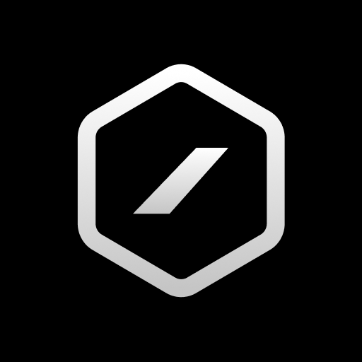
Concept 1 (original)
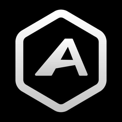
Concept 2 (rollout)
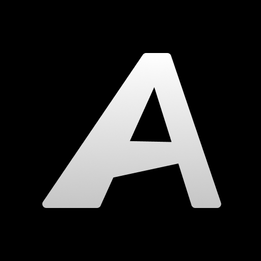
Concept 3 (current)
The original concept was the one displayed before the
rollout, which most users may not have seen. Concept 2
was displayed on the rollout, which is the one that did
not get very good feedback. After some recommended
changes, we now have ended up with Concept 3.
Why Our Previous Branding Didn't Stick
Our previous branding, being 'Lumin Labs' didn't stick
because it no longer matches our goals and what we want
to represent anymore. Instead of being actively
competitive in the development space (being the light),
we instead want to focus on our community and growing
it. Along with this, many organizations with similar
goals as us already exist under the same name, which was
another motivation for us to change the branding.
And as for our logo, we obviously didn't keep it due to
the name change pilot. It looked good for a while,
however, some people started to catch on to its
similarity with the Linux Mint logo, which it was
inspired from. Our community liked it, so we took
aspects from it in order to design our new concept logos
for the pilot.
What We Need From You
In order for this rebrand to go successful, we
need to gather feedback on our logos and name to
appease the masses. If you are reading this article,
make sure to vote in the polls in our Discord when you
finish. We understand that these changes might be
frustrating, but it's simply a part of any community's
lifetime. We are still relatively small, so there is
plenty of room for major improvements like this.
Thanks for reading! - written by James